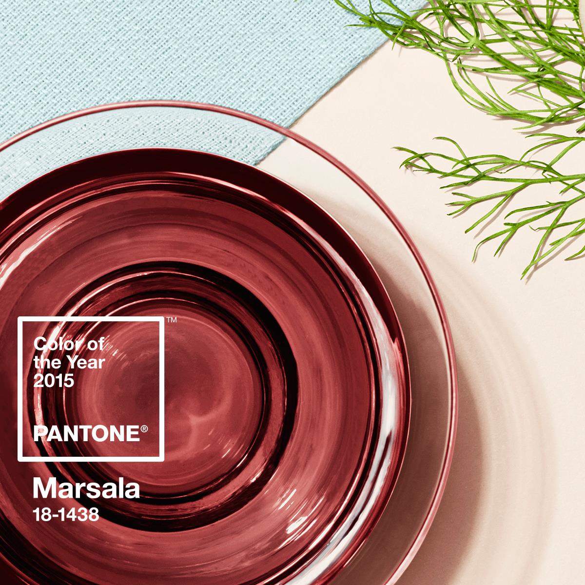
Pantone Color of the Year 2015 – Marsala
It’s here! Pantone, the experts in color, have announced the 2015 Color of the Year – Marsala. I admit, this year, I am a fan!
We’ll see it fashion, we’ll see it in home decor, we’ll see it design and yes, we’ll see it in weddings. Let me me share with you how I envision clients using this color in 2015 and beyond.
The color itself is created by the brilliant minds at Pantone. Pantone creates a standard for printing, each of which is specified by a single number. Every color comes with a set number (some of which are event copy written – Tiffany Blue? – yes, Copy written.) Pantone created these colors so that regardless of where you are in the world the “navy blue font” you see at the stationery store is the same “navy blue font” your invitation is printed. Each year Pantone creates a “Color of the Year.” In 2014 it was “Radiant Orchid” and today they announced “Marsala” as their “Color of the Year” for 2015.
This warm, rustic, earthy, yet sophisticated color is a great neutral color and will be used in many arenas in the wedding industry.
It will look beautiful on many skin tones for your bridal parties and moms. As a neutral, I see it serving as a wonderful font choice for bridal paperie. I envision it as a fantastic linen selection (again because of its neutral qualities and earthy feeling). I also picture it in makeup – for both lip and nail colors, and finally, the floral possibilities with the colors close to Marsala are unlimited.

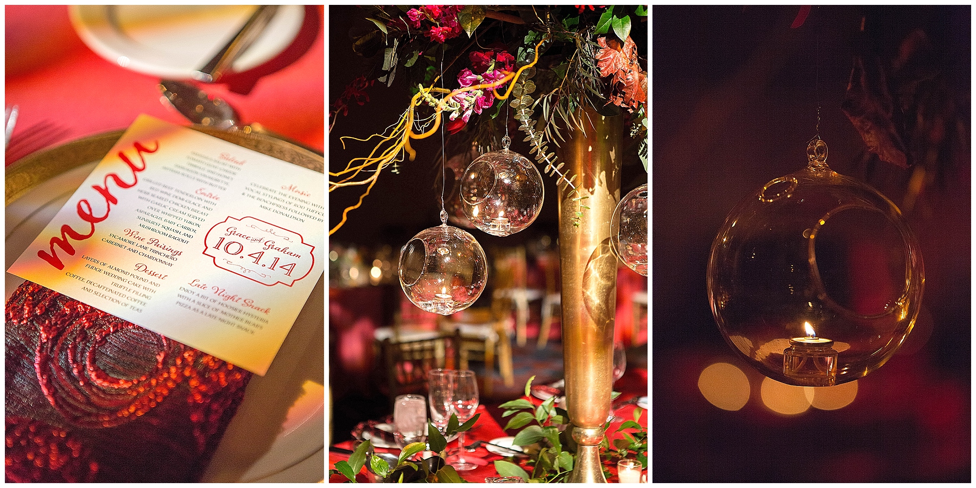
(Admittedly, many of my clients already have used it – isn’t it nice to be so forward thinking) 😉 Here Grace and her beautiful bridesmaids carried beautiful shades of red, poppy, cinnamon and yes, Marsala blooms down the aisle.
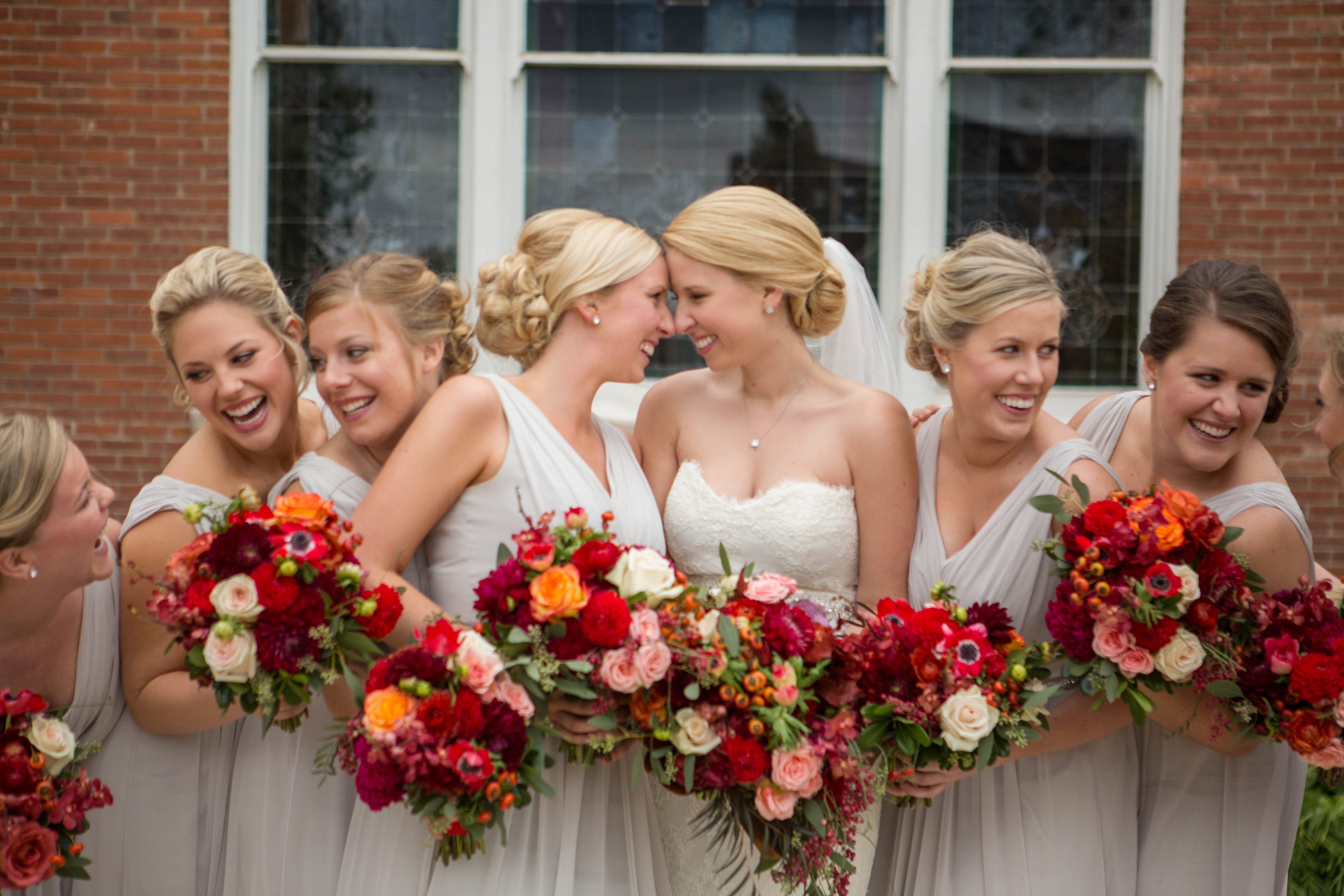
Later at the reception, these gorgeous colors were paired with linens and lighting spreading an entire spectrum of reds and browns. Slightly alter the lighting color one hue or the font a tiny tint and Grace is spot on to the Pantone Color of the Year with her color story. Congratulations Grace, you’re ahead of the curve! 😉 I always thought you were fashion forward!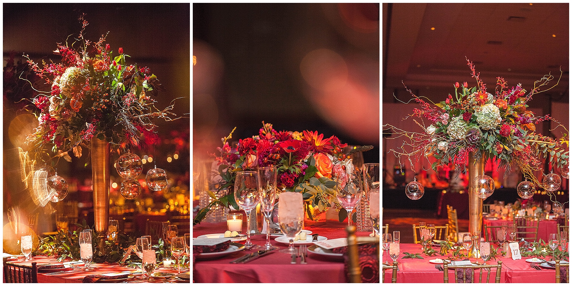
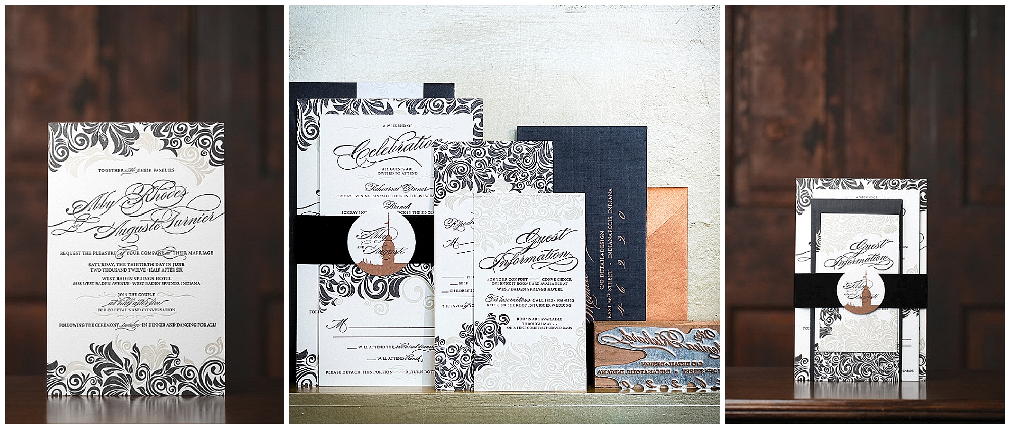
Abby’s wedding invitation suite was classic elegance and refined sophistication. She used a palette so many brides find appealing – black, cream and copper / gold. 2015 Brides – Instead of the copper element – infuse Marsala.
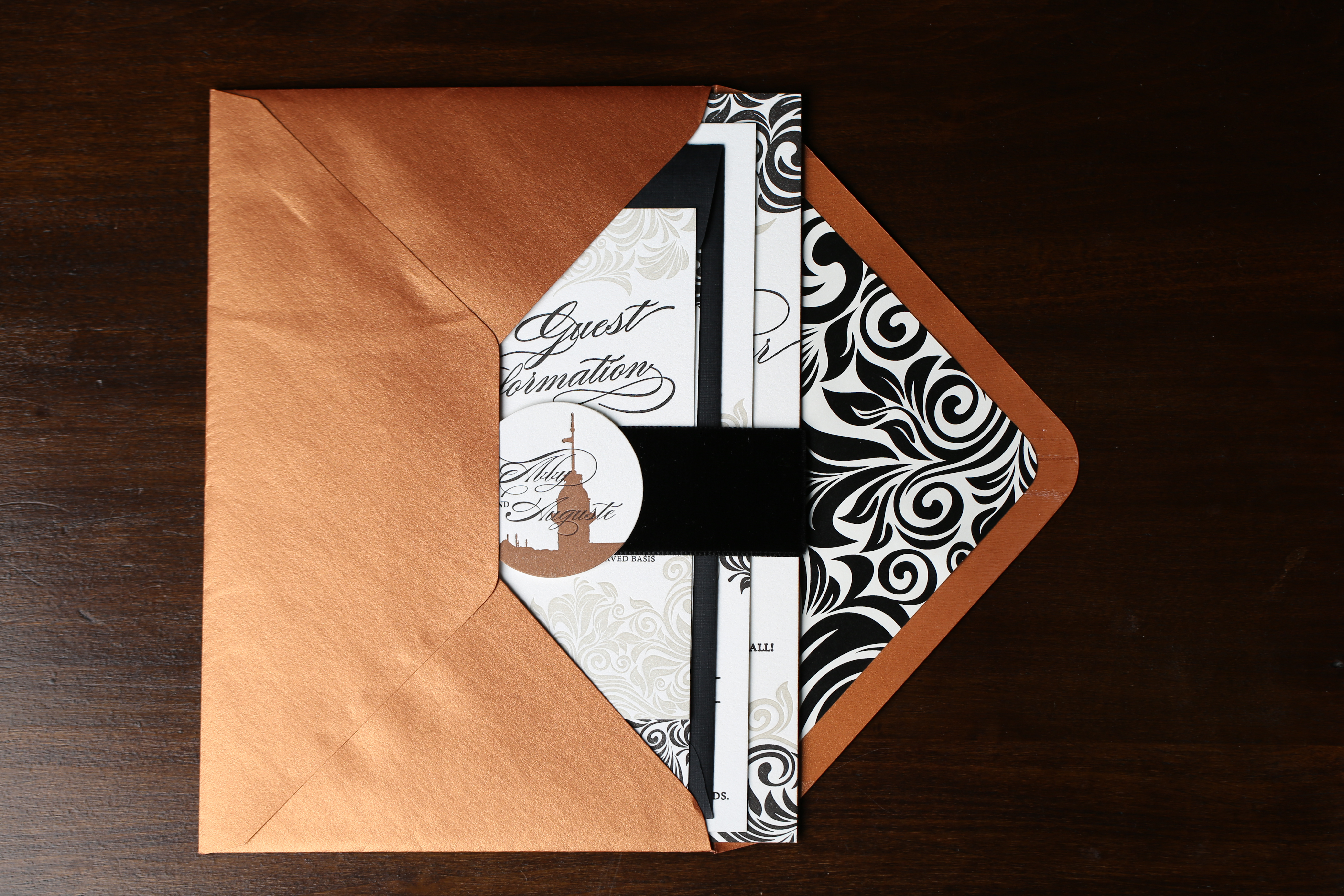
The envelope and coordinating fonts could very easily be Marsala, because as a designer I really love the Marsala color as a neutral. It’s a stunning color with deep undertones that would work well as a warm font, much like copper or gold do for many bridal stationery suites.
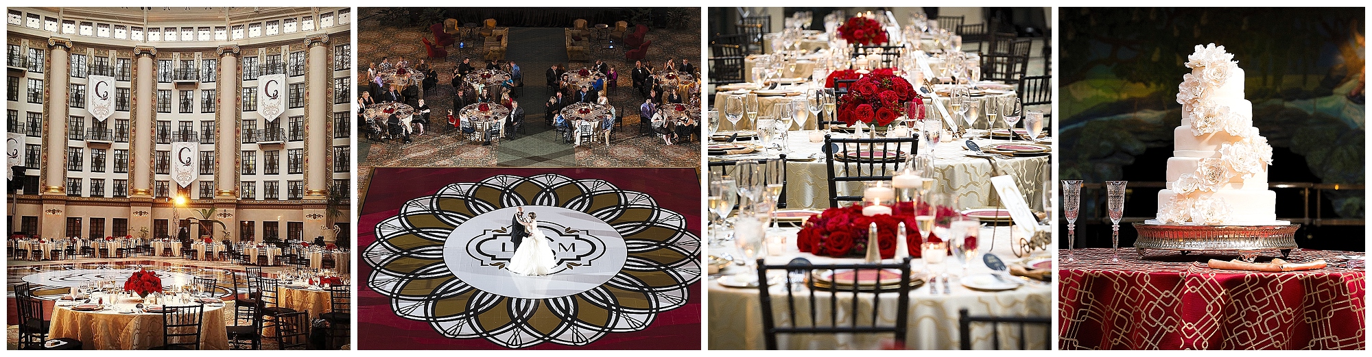
Finally, Lauren used garnet in her wedding, and in the Pantone book of colors, these two are actually very close to one another! Had her stationery designer chosen a few color blocks differently, we’d have called her clairvoyant. 😉 Ultimately, the venue and paperie set the tone for this entire wedding’s decor including the showstopping dance floor.
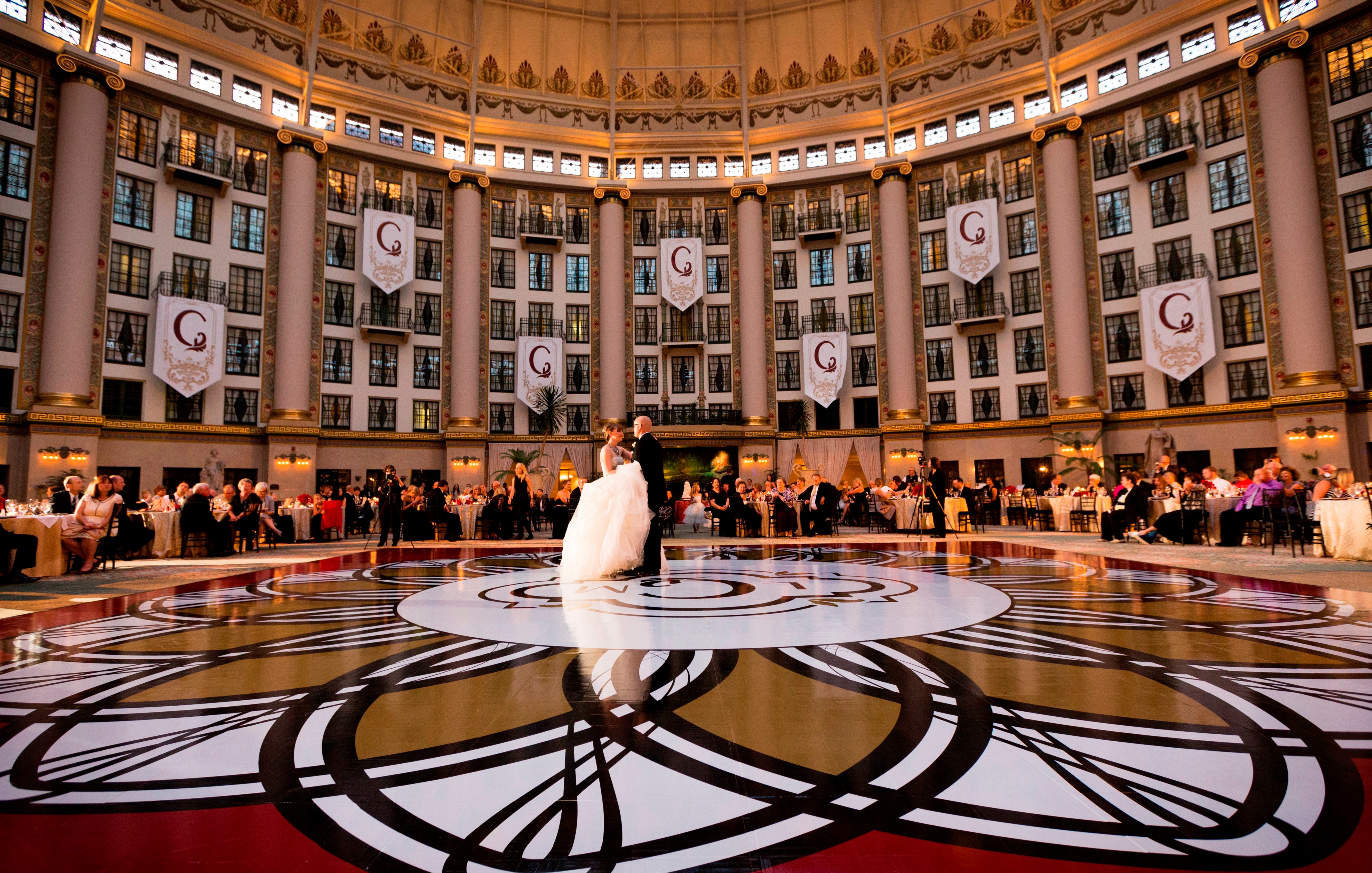
Again, the Marsala color would be a terrific color for both the crisp C on the banners and the deep border surrounding the floor. On the tables, the menu cards and low floral could easily be shades of reds and russet – and of course, Marsala.
I think 18-1438 (as your printer knows it) – Marsala as you will call it – is something that is a color to embrace! It’s got great potential… and I’m looking forward seeing much more of it in 2015 — especially in nail polish… stocking stuffer? 😉
![]()
Special Thanks to: Conforti Photography, Jennifer Driscoll Photography and Nathaniel Edmuds Photography for capturing these fashion forward brides — who knew! 😉